When a candidate opens a page that you created in Beamery, the first thing they’ll see is the header image, which is why it’s important to ensure that your header image looks great across all devices. This article will cover recommendations for image size and design to ensure your page makes a great first impression.
To find out more about how to edit a page in Beamery, check out this article.
When choosing a header image for your page, consider the below diagram: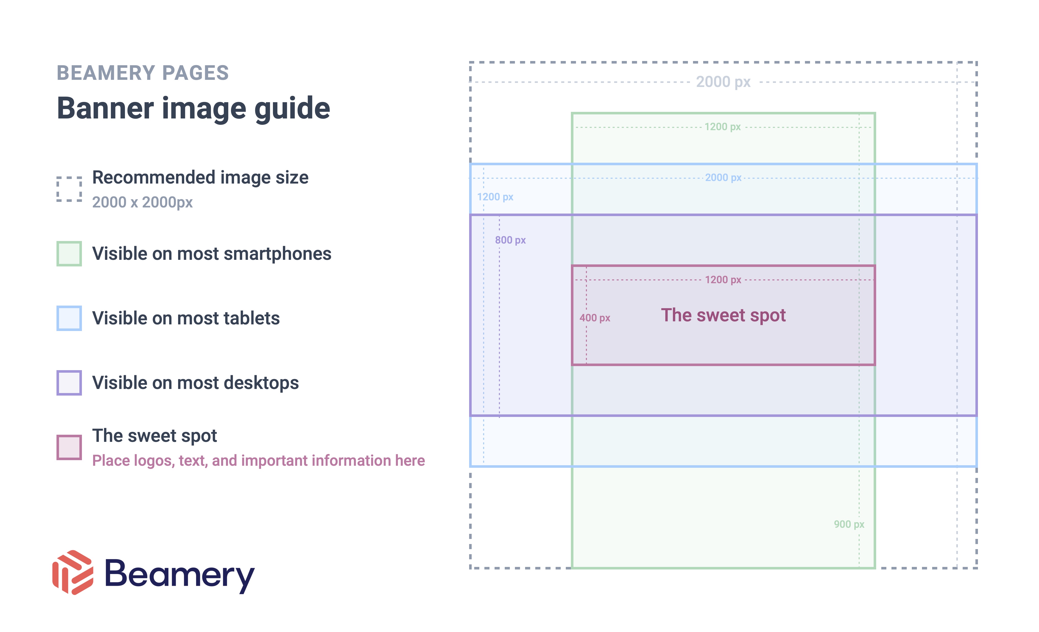
The recommended size for any header image is 2000 x 2000px, however, as a Beamery page is reactively resized for different screen shapes and sizes, visitors to your page will be able to see different areas of the header image when they view your page.
Most visitors to your page who are using a smartphone will see the area highlighted in green. Most visitors to your page who are using a tablet will see the area highlighted in blue. And most visitors to your page who are using a desktop will see the area highlighted in purple.
The section of the image where all three of these areas intersect is labelled the sweet spot. This is where we recommend you place the visual focal point of an image. For example, if your image includes a person the person should fit comfortably within the sweet spot. If your image includes text, the text should fit comfortably within the sweet spot area. Following these guidelines will allow your header image to look great regardless of what device they’re seen from.
In Summary…
Keeping logos, text and the focal points of images in the sweet spot area on the diagram means that your page will look great for everyone who visits it, regardless of the device that they’re using.
Have questions about building Pages in Beamery? Contact support@beamery.com.
Additional Resources:
How to Edit a Beamery Page
An Overview of the Beamery Pages Structure