All Beamery Pages follow a similar structure, made of several variable blocks that can be configured as preferable:
- A header block, with a Call-To-Action (CTA) and an image, typically the company logo
- A “hero” block, with a full-page-width image, and some text on top of it
- A Text+Image block, with text on the left-hand side and an image on the right-hand side
- Increased customization: parallax scrolling, controls
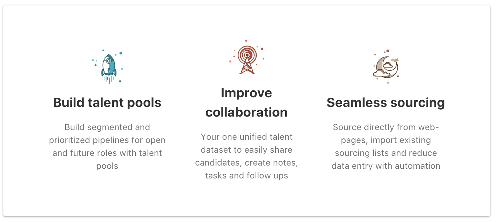
for image/video position, icon size, two- and four-column blocks. - A highlight block, with three blocks of text + logo/picture
- A simple text block
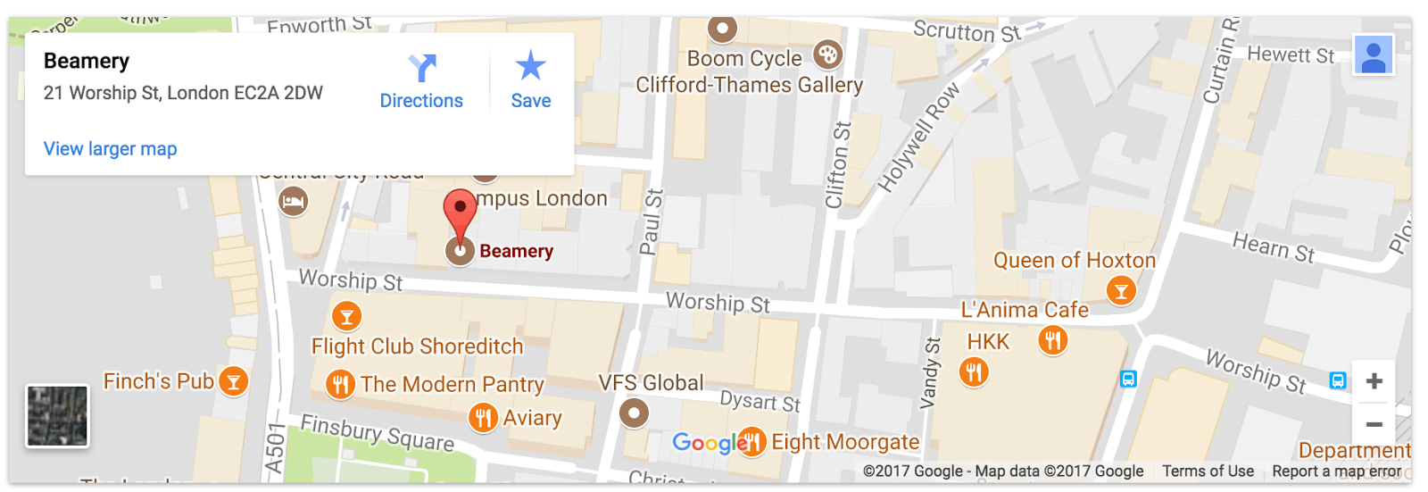
- An iFrame block that can contain a Google Maps, or any other content, such as a list of vacancies (not all ATS support that capacity)
- A text+video block, with a text on the left-hand side and a video on the right-hand side
- A footer with some text and another CTA, that could be different from the header’s CTA
Blocks can be hidden if they are not needed for a particular page. You may also change the order of blocks by using the up and down arrows located in the upper right corner of the block.
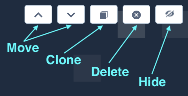
Blocks can be cloned to create more than one instance of a particular block within your page. This can be done by using the clone button, which is visible when editing a block. If you wish to remove a cloned block, you may simply delete it.
Note: original blocks can only be hidden, not deleted.
Custom Fonts
To maintain consistent branding across Beamery Pages at a company level, Administrators can control branding assets via Company Settings, such as company color for buttons and backgrounds, logo, and custom fonts via Google Fonts or Adobe Typekit.
Note: it is also possible to add an additional custom footer containing other social links, disclaimers or privacy notices etc. This block can be configured within the Company Settings page by users with Super Admin or Marketing Admin permissions. To learn more about this click here.
Header

Hero

Text + Image

Split
Text

iFrame
Text + Video

Footer
