Once you have created a Page, you will want to test how that page will be viewed on mobile devices. This ensured readability and increases conversion rates. To test how your page looks on smaller screens, follow the following steps.
Start by opening DevTools by pressing F12 on your Keyboard, or right clicking and selecting 'inspect'
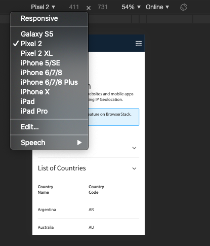
Next, click on the “Device Toggle Toolbar”. This can be found in the sidebar containing the Dev Tools. This may be above, below or to the right or left of your page. The icon will turn blue when the device mode is turned on. 
From the options at the top of the page, choose a device you want to simulate from the iOS and Android devices list. The screen size will adjust the size of the page display and simulate what your Page will look like on different screen sizes.
Click the x in the top right corner of the Dev Tools window to return to your normal screen.